Showing posts with label css3. Show all posts

Thursday, 9 May 2013

Microdata and Breadcrumbs

New Vocabulary

When we moved our website over to HTML 5 it allowed us to start using microdata to markup our information and try to aid search engines and screen readers make sense of the data on our site.

First we chose a vocabulary to use, the vocabulary defines the way we describe our data and what it all means, in the end we decided on using schema.org.


Marking up

Once we had decided what vocabulary to use we then added the itemscope webpage to our template body tag to allow us to define anything inside the <body></body> tags as a property of WebPage. The schema for WebPage is a child of CreativeWork which is in turn a child of Thing.

Then we added some microdata to our town page which is a listing of care and nursing homes in the selected town. We set the listings scope to LocalBusiness which describes "A particular physical business or branch of an organization"[1] and is ideal for our use. We could extend this but we will discuss this later.

Screen shot of the sites town listing page markup. A red box highlights the microdata
Town Listing Markup

LocalBusiness has certain properties which are used to describe attributes think of it like OOP (Object Orientated Programming) where you have objects and those objects have attributes such as a Person object that could have attributes eye colour, hair colour etc..

Our town page has information about each listing and the associated itemprop such as the homes name, address, telephone, fax, geographical coordinates (meta data), url and description.

By using the itemprop attribute we can help describe exactly what each bit of text means in our webpages.


Leaving a Trail

Next we added some breadcrumbs to the site templates main navigation sections which are inside HTML 5 <nav> tags. Breadcrumbs can be used to help define the hierarchy of your site and can also be used by search engines. The screen shot below show a Google SERP which is displaying some breadcrumbs for the search keywords "microdata breadcrumb"[2].
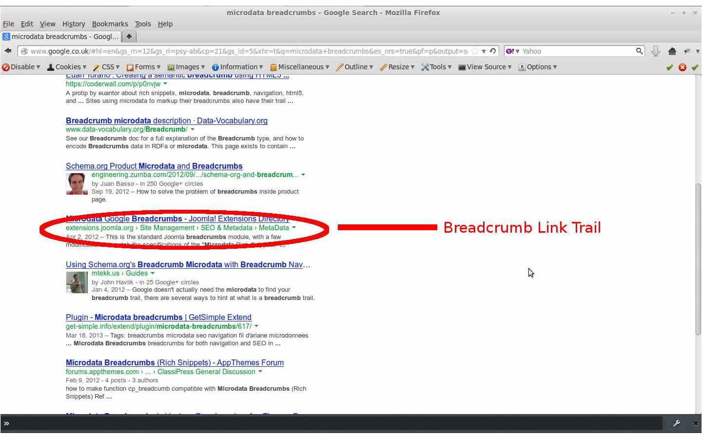
An image of a SERP page with breadcrumbs under the anchor text which is highlighted by a red elypsis
Breadcrumb Link Trail


Our site makes use of the title and url properties and we hope implementing breadcrumbs will aid any robots crawling our website and also allow our users to access the pages hierarchical links. Here is some further reading on breadcrumbs.

Breadcrumbs Inside Nav Tags


Extending Vocabulary

We are considering extending the vocabulary for LocalBuisness to make our data even more granular the parent child relationship between schemas could be used to create a CareHome schema which could extend the LocalBuisness schema.

Currently we feel it would be beyond our websites scope to start providing custom schemas although it has been added to our possible feature list and will be considered at a later date.
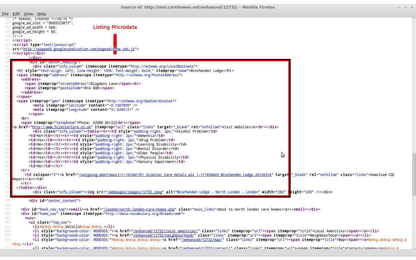
A screen shot of HTML markup with a red square highlighting the listings microdata
Listing Microdata


Conclusion

We hope this article has given you a better understanding of microdata and how The Care Homes Directory has integrated this technology into our website templates.

As always we will be reviewing our microdata and also cleaning up the current tags we have, as there is always room for improvement. We are also considering adding more item properties to our site.

Please check back soon because we will be writing some more articles and hope you find them useful. We will be producing a guide to using The Care Homes Directory Enhanced Listings on our site soon and an article on our development platform and development practises.

You can also contact me using my Google Plus account name, Chris Elsen.


Appendix

[1] http://schema.org/LocalBusiness
[2] SERP results (originally accessed on 2013-05-09)

Saturday, 4 May 2013

Moving Forward With HTML 5 and CSS3

Porting Templates

We have now moved our website templates over to HTML 5 and CSS level 3 also switching to a tabless design using inline blocks, divs and unordered lists for navigational links. It is a kind of hybrid design between a fixed width website and an elastic layout.


Screen shot of the index page
Index
The site was originally designed in early 2000 and was in need of a new overhaul. It had been overhauled once before from HTML 4 to XHTML but apart from this it has mainly stayed the same. I always like to think content is king and layout is queen.

Main site navigation in the header and footer are now unordered lists (<ul>) which are displayed inline making them horizontal. The left navigation bar uses the same approach but is a vertical list of links with text-align set to right.

Using the border-radius property allows us to round the corners for our header and footer blocks. Rounded borders look more appealing than square.


Our site now uses emphasis (em) for defining the font size of text this allows us to scale up/down the text size if the user has a browser zoom level other than 100%. The font family we use is Verdana, Arial, Helvetica, sans-serif these are considered web safe and are my preferred style.


Screen shot of the sites index page markup
Markup
One of the first tasks we had was defining a minimum screen resolution of which to support in the end we decided that 1024x768 would suffice according to this webpage only 13% have this resolution (January 2012) and 1% used 800x600.

Using the CSS properties for min-width and max-width we can set the size in pixels of the wrapper div for us this is 1280px. By giving it a width in pixels it stops the site layout crunching up when the browser window is minimised. We are in the process of making all our borders and margins use emphasis (em) instead of pixels.

We did encounter some problems with internet explorer 7 which is the lowest version we have decided to support. We had to create a separate CSS file for IE7 to fix a problem with the header link widths. In IE7 these are set to 24% and all other browsers it is 25%.

The website still displays in lower versions but it does not look as good. Other major browsers display the website correctly as they tend to follow standards a bit better.

Padding was another problem which was encountered due to the box model adding it and any margins to the outside of a container which can cause overflow. I learnt a little trick to make it add any padding and/or margins to the inside of the box. You need to use the CSS box-sizing property and give it the value border-box.

Although HTML 5 has yet to be ratified and is still in the draft stage we feel it is sufficiently complete for our use. We also feel that aiming to use more recent web technology will help future proof our website.


Over time we will be implementing a style sheet specifically for mobile devices by using the media attribute of the link tag. We will also be modifying the template using the CSS display property to make the right column merge into the centre column.

We will be writing a future article focusing on implementing the mobile style sheet and on testing our new site design and the cross browser nightmare that can ensue. Finally please take a moment to visit our site.