Porting Templates
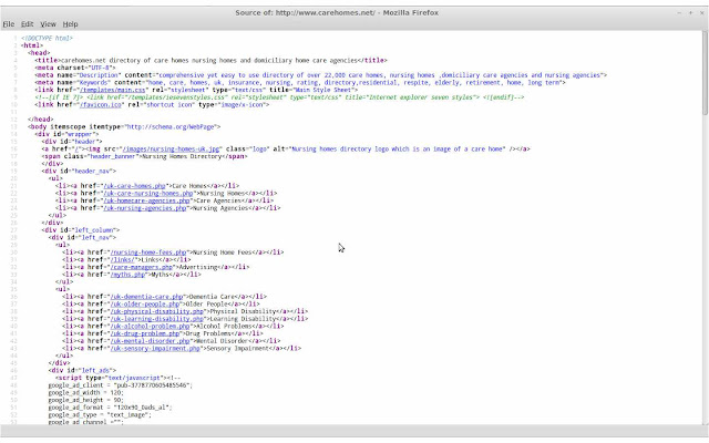
We have now moved our website templates over to HTML 5 and CSS level 3 also switching to a tabless design using inline blocks, divs and unordered lists for navigational links. It is a kind of hybrid design between a fixed width website and an elastic layout. |
| Index |
Main site navigation in the header and footer are now unordered lists (<ul>) which are displayed inline making them horizontal. The left navigation bar uses the same approach but is a vertical list of links with text-align set to right.
Using the border-radius property allows us to round the corners for our header and footer blocks. Rounded borders look more appealing than square.
Our site now uses emphasis (em) for defining the font size of text this allows us to scale up/down the text size if the user has a browser zoom level other than 100%. The font family we use is Verdana, Arial, Helvetica, sans-serif these are considered web safe and are my preferred style.
 |
| Markup |
Using the CSS properties for min-width and max-width we can set the size in pixels of the wrapper div for us this is 1280px. By giving it a width in pixels it stops the site layout crunching up when the browser window is minimised. We are in the process of making all our borders and margins use emphasis (em) instead of pixels.
We did encounter some problems with internet explorer 7 which is the lowest version we have decided to support. We had to create a separate CSS file for IE7 to fix a problem with the header link widths. In IE7 these are set to 24% and all other browsers it is 25%.
The website still displays in lower versions but it does not look as good. Other major browsers display the website correctly as they tend to follow standards a bit better.
Padding was another problem which was encountered due to the box model adding it and any margins to the outside of a container which can cause overflow. I learnt a little trick to make it add any padding and/or margins to the inside of the box. You need to use the CSS box-sizing property and give it the value border-box.
Although HTML 5 has yet to be ratified and is still in the draft stage we feel it is sufficiently complete for our use. We also feel that aiming to use more recent web technology will help future proof our website.
Over time we will be implementing a style sheet specifically for mobile devices by using the media attribute of the link tag. We will also be modifying the template using the CSS display property to make the right column merge into the centre column.
We will be writing a future article focusing on implementing the mobile style sheet and on testing our new site design and the cross browser nightmare that can ensue. Finally please take a moment to visit our site.
No comments:
Post a Comment